All Guides - Start Here
Beginning
Setting Up Guide
Marketing Guide
Tools
Tool Guide
Tools
Wood
Wood Guide
Carving Guide
Finishing Guide
Sign Designs
Sign Shapes
Shape Dimensions
Methods
Background Guide
Design Guide
Layout Guide
Shipping Guide
|
Tool up
- Measuring tapes, in & mm scales
- Calipers / dial indicator guage
- Yard sticks
- Straight edges, 1' and 3'
- Triangles
- Carbon paper, transfer / freezer paper
- Large Compass / string
- Black sharpies, pens, markers
- Grid paper, Masking paper
- External (Red) double sided tape, painters tape
- Scissors, X-Acto knife
- Scraper, putty knife, blades
Carving
- Lightly sand the wood face; leave back as is
- Use sanding sealer before any layout or carving of pine boards
- Use sanding sealer on any worn, aged boards or with divots or loose grain
- Add top, middle and bottom reference lines before carving
Laying Out
- Check Spelling, esp. names!!
Lay out letter sizes
- Determine inset or outset
- Determine letter fonts and sizes
- Lay out longest line first
- Set letter in the middle of the sign left to right, top to bottom
- Set a pencil at the letter bottom and draw a rule line
- Lay out letters along that line and repeat for other lines
- Not enough letters? Use similar letter as place holder, mask off before spraying
- Give outset letters more space
- Inset letters can almost touch each other
- Square up and place the spacing, measuring from ends to each letter
- Balance largest letter lines top to bottom
- Balance other letter / art spacing on lines above and below
- Base lines that allow clearance for the cloud
- Rough in the design and white spaces
- Finalize the exact position of every single detail
- Snap a picture and show it around. Get other opinions
Double check:
- Locations, locations & locations
- Go over each letter comparing to the font printout
- Square - to the top edge and to each other
- Spacing - inset vs outset
- Spelling of company logos and people's names
- Wrong Letter orientation and letter / number substitutes
- Punctuation mark omissions, misplaced or sign anomalies
- White space is consistent throughout the entire sign
Also look for:
- Inset can be closer to the edge
- Inset letters can be closer to each other
- Outset can not be close to the edge
- Allow edge clearance for the cloud on outset
Layouts:
- Draw 3 base line marks for each line- letter tops, middles and bottoms
- Large signs have to be perfect! Flaws in large products show
- Fancy fonts? Check font sheets for letter orientation
- Layout templates and patterns have to be precise
- Create full size font sheets for carbon transfers
- Determine border styles
- THEN determine line counts, outset/inset and line locations
|
Spraying
- Check temperature and cool or heat as necessary 1st
- Ink, Primer - shake can well
Mask off:
- Rule lines, Art lines, patterns
- Missing letters, missing punctuation marks or substitute letters
- Divots, cracks, splits, knots or raised grain areas
- Any place that will bleed ink or primer
Spraying
- Take your time
- Spray in short bursts holding can high and work down as needed
- Vertical spraying = blowing letters off, spitting and splatters
- Spray top of sign down, then bottom up
- Light shadowing is all that is needed for lettering and patterns
- Blue tip = fine spray
- Draw or re-draw rule lines across letter tops, middle and bottoms
- Add punctuation marks or pencil lines for missing letter areas free hand
- Add cloud lines
Pattern Suggestions
- Pattern sets of 10 (3.5 x 3.75) $25
- 1/8 Birch Plywood
- Animals
- Birds
- Cats
- Christmas / Holidays
- Christian
- Cocktails
- Dogs
- Farm
- First Responders
- Fish
- Halloween
- Hunters & Wildlife
- Jets
- Miscellaneous
- Music
- Nautical
- Patriotic
- Scrolls & Vines
- Southwest
- Sports
- States
- Tractors & Machines
- Trees & Flowers
- Valentines
- Weddings
- Western
Place patterns side by side (inset facing outset) not top to bottom.
Fonts
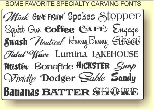
- Make font sheets; landscape A - M rows upper and lower case for each font
- Font selection: Times New Roman, Clarendon, Western, Tiki, Fatty Font, Bookman, Universal condensed, Edwardian Script
- Font sizes: .5, 1, 1.5, 2, 2.5, 3, 3.5 4, 6
- Skewed - Italic: top and bottom adhere to base lines but are slanted 10 degrees to the right.
- Hard to read at a distance - used for accent or directions
- Tilted - slanted: Letters do not remain on the base line
- Used for emphasis, visual effects and eye appeal
- Add top, middle & bottom reference lines before carving;
- Select & re-scale
- Use font print outs during layout and have it in front of you; Watch for mirror images
Check the original font style and orientation:
- Mark orientation on the back of each letter or spray the back side yellow or white
- Legs - stroke on the left is narrower on left than right side: A N
- Backwards, upside down letters; N has serif on top, point on bottom
- S is wide on the bottom, narrow on top
- O letter is round, 0 number is oval
- W left is wide, right is narrow and slanted
- M is not slanted
- X Top right to bottom left is narrow
- Y, V Right side is narrow
- Substitute letters: M for W etc.
- Substituting letters for numbers, numbers for letters; 0 for O
Very large letters
- Enlarged on the printer to the correct size for the sign
- Lay the paper in place and tape across the top
- Slide carbon paper under and trace using a stylus
- Different fonts use different spacing called leading.
- Wider spacing on large letters may be ok. Double check often during layout!
Layout may be slightly wider than normal due to font leading. Fix this on the computer by reducing the size of the spaces between the letters. If the letter is 36 then drop the space between to 12 etc.
Small Artwork
- Tape it down on one side or
- Glue paper to the board
- Lift and spray glue
- Let it dry for 2 minutes
- Keeping the back of the paper up, lower the paper so the taped side contacts the glue first
- Use a putty knife or flat surface to squeeze out air as the paper is lowered
|
Letter & Pattern Layouts
Large patterns can be cut into sections or folded for storage
Reversible templates take 3 seconds to spray; printing and carbon paper takes much more time
- Make from Acrylic, birch ply, hardboard
- 1/8 thick letters
- Cut out wood patterns can contain intricate detail
- Use 1" square graph paper for scaling up large patterns
- Multiply by final measurements to make the pattern
Some Sources
- Larger templates in art stores
- Stencils
- Coloring Pages
- Pictures of silhouettes re-scaled
- Pictures / images on the sides, not top or bottom esp. with squared signs
- Clip Art (watermarks = copyrighted)
- Line art (no watermarks ok)
- Grid paper; Fold in four, count out inches and cut out pattern. Then glue on and cut out
Arches
- Set letter in the center and set pencil on the bottom
- Draw with a finger in an arch across the wood to set the bottom line
Alternative methods
- Lay out letters in a rough arch so one letter is exactly in the middle of the new arch
- Put a pencil mark at the bottom of the highest letter
- Set clamps at the bottom of the outermost letters
- Flex a piece or thin metal or wood to bend the arch and draw the arch line
- Make arch patterns from 1/4 stock: 12x24, 6x24, 4x18, 4x14
Letter Sets
- Fonts like Bookman, Clarendon, Fatty, Tiki, Universal Condensed, Western
- Sizes like .5, .75, 1, 1.5, 2 - 6
- American Sign Letters 4 - 36
Transfers, Small & Large
This process can be scaled up from one piece of paper to several. To make posters make sure the margin prints out the index marks for cutting later
NOTE: Letters and images will print out backwards, so the program has to swap the image left to right BEFORE printing. Hence the software
Software for Poster creation
Software for photo manipulation
Logos
- Use imaging software to flip the image for transfers
- Images are backwards from the original
- TIP: Make a copy and flip or invert it, then copy again on transfer media
Transfers
- Get the image and expand it to fit
- EXAMPLE: Original print out is 4.5 but wants 12. 12.0 / 4.5 = 2.66 x 100 = 266%
- 266 % = 12 x 12 (1 ft2)
- Splice 8 1/2 x 11 down the center
- Check colors and customer specs
- Place a blank piece(s) of the transfer paper you will use onto the board in the exact final position needed
- Using masking tape place tape NEXT TO the top, bottom and each corner as index marks for locating the transfer paper after printing
- Remove the paper from the board, leaving the taped transfer marks
- Print the transfer onto the paper
To make better transfers spray silicone spray or WD-40 on the printing side and wipe off before printing. Spraying the paper before printing extends the working time. Working time is 2 - 3 hours after printing, but shorter time yields better results.
- Freezer paper - print on glossy side
- Label backing - print on glossy side
- Ink remains wet so handle carefully so as not to smear the image
Multiple page posters:
- Lay the transfer ink side up
- Align the registration marks on each page and make cuts for overlapping each piece
- Use small pieces of tape to carefully stick the pages together LOOSLY so they can be un-done as the poster alignments are adjusted
- Tape the seams together on white spaces
- No tape over inked areas
- The entire set of papers should now be one large poster with no tape on the printed parts
- Turn the entire transfer over onto the board at the top index marks and lay the papers down slowly, being careful not to smear
- Use small tape pieces to keep papers together
- Double check and adjust the final position
- WITHOUT MOVING the transfer, carefully tape the top edge onto the board
- Taping the sides and bottom may be necessary
- Using a spoon,, roller flat squeegee or flat plastic rub the transfer onto the board
- Use extra pressure where paper seams are located in the image
- Occasionally lift the bottom to check for blank spots
- Work from the top down
- Carefully lift the paper to check your work
|

